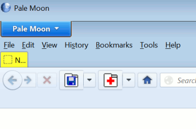
On opening a new window in Pale Moon, you may find a "double layer" taking up extra screen space unnecessarily, with the blue Pale Moon button top left (with text not icon) - even if you've chosen to view the menu bar and the original window displays properly. Here's what my new windows look like:
 Something odd's going on because it should display the button or the menu bar, not both! Possibly a bug, only started happening recently for me.
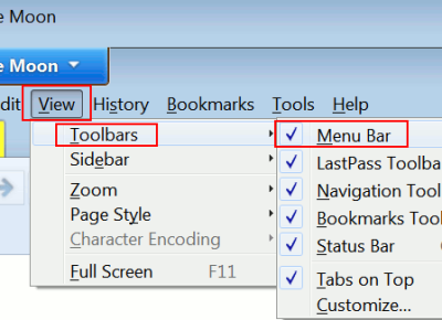
Here's my workaround or fix. To get rid of the top "bar", just hide the menu bar by UNticking it - menu View > Toolbars > Menu Bar, so that there's no tick against "Menu Bar":

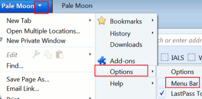
Then, show it again by using the arrow against the Pale Moon blue button - choose Options, Menu bar:
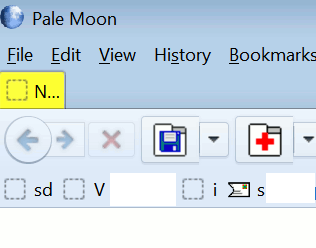
Now the new window should be normal again:
 But be warned, it's more of a workaround than permanent solution because it doesn't solve the problem going forward, and you may have to go through this process all over again for every new window you open in Pale Moon!
