TextField
PUBLISHED
Dependencies
- Tizen 2.4 and Higher for Mobile
- Tizen 3.0 and Higher for Wearable
Content
Related Info
The Dali::Toolkit::TextField class is a control providing a single-line editable text field.
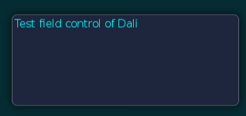
Figure: TextField
In this tutorial, the following subjects are covered:
TextField events
The following table lists the basic signals provided by the Dali::Toolkit::TextField class.
Table: Dali::Toolkit::TextField input signals
| Input signal | Description |
|---|---|
TextChangedSignal() |
Emitted when the text changes. |
MaxLengthReachedSignal() |
Emitted when inserted text exceeds the maximum character limit. |
InputStyleChangedSignal() |
Emitted when the input style is updated as a consequence of a change in the cursor position. |
Creating a TextField
Before text has been entered, the Dali::Toolkit::TextField class can display a placeholder text. An alternative placeholder can be displayed when the TextField has keyboard focus. For example, a TextField used to enter a username can initially show the text Unknown Name, and the text Enter Name. when the cursor is visible.
TextField field = TextField::New();
Property::Map propertyMap;
propertyMap[ Text::PlaceHolder::Property::TEXT ] = "Unnamed Name";
propertyMap[ Text::PlaceHolder::Property::TEXT_FOCUSED ] = "Enter Name.";
field.SetProperty( TextField::Property::PLACEHOLDER, propertyMap );
Stage::GetCurrent().Add( field );
When the TextField is tapped, it automatically gets the keyboard focus. Key events enter the text, and the placeholder text is removed. After text has been entered, it can be retrieved from the TEXT property.
Property::Value fieldText = field.GetProperty( TextField::Property::TEXT );
std::string fieldTextString = fieldText.Get< std::string >();
Aligning Text
The Dali::Toolkit::TextField class displays a single-line of text, which scrolls if there is not enough space for the text displayed. If there is enough space, the text can be aligned horizontally to the beginning, end, or center of the available area:
// "CENTER" or "END"
field.SetProperty( TextField::Property::HORIZONTAL_ALIGNMENT, "BEGIN" );
TextField Properties
Using Decorations
For text decorations, the following TextField class properties are available. All properties are writable and none are animatable.
Table: TextField properties
| Property | Type | Description |
|---|---|---|
RENDERING_BACKEND |
INTEGER | The type or rendering e.g. bitmap-based |
TEXT |
STRING | The text to display in UTF-8 format |
PLACEHOLDER_TEXT |
STRING | The text to display when the TextField is empty and inactive |
PLACEHOLDER_TEXT_FOCUSED |
STRING | The text to display when the TextField is empty with key-input focus |
FONT_FAMILY |
STRING | The requested font family |
FONT_STYLE |
STRING or MAP | The requested font style |
POINT_SIZE |
FLOAT | The size of font in points |
MAX_LENGTH |
INTEGER | The maximum number of characters that can be inserted |
EXCEED_POLICY |
INTEGER | Specifies how the text is truncated when it does not fit |
HORIZONTAL_ALIGNMENT |
STRING | The line horizontal alignment |
VERTICAL_ALIGNMENT |
STRING | The line vertical alignment |
TEXT_COLOR |
VECTOR4 | The text color |
PLACEHOLDER_TEXT_COLOR |
VECTOR4 | The placeholder-text color |
PRIMARY_CURSOR_COLOR |
VECTOR4 | The color to apply to the primary cursor |
SECONDARY_CURSOR_COLOR |
VECTOR4 | The color to apply to the secondary cursor |
ENABLE_CURSOR_BLINK |
BOOLEAN | Whether the cursor should blink or not |
CURSOR_BLINK_INTERVAL |
FLOAT | The time interval in seconds between cursor on/off states |
CURSOR_BLINK_DURATION |
FLOAT | The cursor will stop blinking after this number of seconds |
CURSOR_WIDTH |
INTEGER | The cursor width |
GRAB_HANDLE_IMAGE |
STRING | The image to display for the grab handle |
GRAB_HANDLE_PRESSED_IMAGE |
STRING | The image to display when the grab handle is pressed |
SCROLL_THRESHOLD |
FLOAT | Horizontal scrolling will occur if the cursor is this close to the control border |
SCROLL_SPEED |
FLOAT | The scroll speed in pixels per second |
SELECTION_HANDLE_IMAGE_LEFT |
MAP | The image to display for the left selection handle |
SELECTION_HANDLE_IMAGE_RIGHT |
MAP | The image to display for the right selection handle |
SELECTION_HANDLE_PRESSED_IMAGE_LEFT |
MAP | The image to display for the left selection handle marker |
SELECTION_HANDLE_PRESSED_IMAGE_RIGHT |
MAP | The image to display for the right selection handle marker |
SELECTION_HANDLE_MARKER_IMAGE_LEFT |
MAP | The image to display for the left selection handle marker |
SELECTION_HANDLE_MARKER_IMAGE_RIGHT |
MAP | The image to display for the right selection handle marker |
SELECTION_HIGHLIGHT_COLOR |
VECTOR4 | The color of the selection highlight |
DECORATION_BOUNDING_BOX |
RECTANGLE | The decorations (handles etc) will positioned within this area on-screen |
INPUT_METHOD_SETTINGS |
MAP | The settings to relating to the System's Input Method, Key and Value |
INPUT_COLOR |
VECTOR4 | The color of the new input text |
ENABLE_MARKUP |
BOOLEAN | Whether the mark-up processing is enabled |
INPUT_FONT_FAMILY |
STRING | The font's family of the new input text |
INPUT_FONT_STYLE |
MAP | The font's style of the new input text |
INPUT_POINT_SIZE |
FLOAT | The font's size of the new input text in points |
UNDERLINE |
MAP | The default underline parameters |
INPUT_UNDERLINE |
MAP | The underline parameters of the new input text |
SHADOW |
MAP | The default shadow parameters |
INPUT_SHADOW |
MAP | The shadow parameters of the new input text |
EMBOSS |
MAP | The default emboss parameters |
INPUT_EMBOSS |
MAP | The emboss parameters of the new input text |
OUTLINE |
MAP | The default outline parameters |
INPUT_OUTLINE |
MAP | The outline parameters of the new input text |
HIDDEN_INPUT_SETTINGS |
MAP | Hides the input characters and instead shows a default character for password or pin entry |
PIXEL_SIZE |
FLOAT | The size of font in pixels |
ENABLE_SELECTION |
BOOLEAN | Enables Text selection |
PLACEHOLDER |
MAP | Sets the placeholder : text, color, font family, font style, point size, and pixel size |
ELLIPSIS |
BOOLEAN | Whether we should show the ellipsis if it is required |
To change the color of the text, use the TEXT_COLOR property. An alternative color can be used for placeholder text by setting the PLACEHOLDER_TEXT_COLOR property. Unlike the Actor::COLOR property, these properties do not affect child actors added to the TextField.
field.SetProperty( TextField::Property::TEXT_COLOR, Color::CYAN );
field.SetProperty( TextField::Property::PLACEHOLDER_TEXT_COLOR, Color::BLACK );