Saturday, May 10, 2008

A silly image


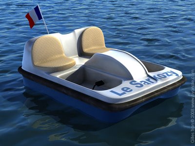
A quick (45 minutes for the model, another 45 minutes for the environment, everything done in Cinema 4D) silly image to celebrate the future of the French Navy, given the current indecision relative to the construction of a second aircraft carrier. Not that I care, really, but I liked the idea of a pedal boat named after the diminutive Sarkozy (thanks to Marc Jacquier for the inspiration).

Labels: ,

Thursday, May 8, 2008

Organic art

1stAveMachine is a New York based computer graphics studio that specialises in photorealistic organic animations like these:


Wonderful stuff, but somehow it's something of a pity that such wild imagination has to be tamed and restrained by what ultimately foots the bill, in this case advertising.

Labels:

Wednesday, May 7, 2008

Office animations

A couple of years ago, we decided to reorganise our office space. Since it involved moving large pieces of furniture (including 3 libraries full of books and archives), I proposed to make a simulation first, to optimise the reorganisation. Finally we didn't change anything - it would have taken a good week - but I did a couple of animations with Cinema 4D and Advanced Renderer. Neither the models, texturing and the lighting are very elaborate: the models are just textured cubes (plus an iMac model I found on the French Cinema 4D website, even though we don't have Macs) and there's a lot of flickering due to the low radiosity parameters.

I planned to redo them with finalRender but this takes a lot of time and frankly it's not worth it. In any case, these videos were gathering dust on my hard disc, so they may as well be published here.

The first video is a time-lapse animation of the office from sunrise to sunset. You can see the time flying in the little corner in the bottom right corner. I used C4D's sky plugin to get the "true" light and sky colours from the lat/long coordinates of my office.


The second video is a fly-over of the office, as experienced by a (very sober) fly. It was just fun to do and wish I had the time to make it more realistic and detailed.

Labels:

Sunday, April 27, 2008

Handmade 3D

The Freres Hueon (apparently a couple of brothers from Bordeaux, France, but little information is available about them) made a "sweded" remake of the light cycle race in Tron, using cardboard props instead of computer graphics. As a Tron fan, I find this mightily impressive.


I should have a special altar built for Tron, as it is the original source of my deep love for computer graphics. I saw it in 1982 and found it so extraordinary and visually groundbreaking at that time that I sat through two consecutive showings. As we know, Tron was a commercial failure, and CG didn't really made it in the movies until Jurassic Park, 11 years later.

Still, Tron remains interesting in the way the authors took advantage of the limitations of the available technology. More recent movies overestimate the ability of 3D technology, so visual effects that look fantastic when the movie is released look fake and awkward after a few years (if not a few days), with characters deep into the uncanny valley and flat lighting. Tron has some cheesy parts (it was a mainstream Disney movie made in the 80s after all), but the effects, simple as they are, are still very pretty.

The Tron DVD also contains the following tidbit: as 3D was still largely experimental, the companies hired to create the computer graphics used very different technologies. Basically, one used polygons (for the Solar Sailer for instance) while the other used primitives (notably for the Light Cycles). The latter technology gave better, shinier results but with a price: in the DVD, we can hear Syd Mead, the designer hired to create the Cycles, lament the fact that his original smooth, curvy, organic-looking design had to be dumbed down into a bunch of spheres and cylinders... It is amusing that this debate still exists today in the POV-Ray community, where some users make a point of using only script and primitives while others have embraced polygon modelers.

Labels:

Thursday, March 27, 2008

Reach for the stars: the story that never was

Reach for the stars
In 2002, I was invited by Chris Cason, the leader of the POV-Ray development team, to work on a very special project: the creation of a computer-generated image that would be rendered on board of the International Space Station. With fellow POV-Ray artist Jaime Vives Piqueres, we designed the image according to a drastic set of specifications, then the image script and 3D models were sent to internet entrepreneur and astronaut Mark Shuttleworth (who would create the Ubuntu Linux distribution two years later) who loaded it on a laptop, turned it into a big-size image while floating in zero-gravity, and came back to Earth. The entire story is told here and there's not much more to say about the image itself.

The strangest thing, however, is that we completely failed to make that story interesting to other people. We naively believed that the concept of two (unknown) geeks managing to smuggle artwork on the ISS thanks to a "space tourist" was, if not newsworthy, at least cool enough for people to notice it, particularly in the computer graphics and open source communities. The simple fact that Chris Cason had to modify POV-Ray to accommodate zero-gravity was an interesting tidbit: how many popular software, let alone open source popular software, include special code to go to space. And of course this image remains the first one rendered in orbit.

Some folks did like the story: Zazzle, the poster company, created a special page for it. There's a page about the image in the Polish Wikipedia and once in a while a teacher wants to use the image for a school project. But otherwise, the story was lost in the flow. We submitted it several times to Slashdot, the popular "news for nerds" website that caters to open source enthusiasts, to no avail. DAZ, the company that had created the child model used in the picture, turned us down because they believed that our story was critical of the model (it wasn't). I posted it to a forum dedicated to space flight and astronomy news: no answer. I wrote to people who had a special interest in space-related artwork: no answer. Outside the POV-Ray community, where a few people at least reacted to it, the story fell completely flat and wasn't picked up: it made a brief appearance in a French CG website, and, some years later, it resurfaced in a couple of posts in the Ubuntu forums when people discovered it in Mark Shuttleworth's resume, but by far and large our story was ignored by bloggers and on-line forums.

Now there are many reasons for the failure. The timing was terrible because we couldn't use the short window that was the space flight itself: the laptop with the image on it came back months later, once the flight was completely forgotten. Also, we didn't really push the story: we thought that it had legs, that it would run by itself and sort of snowball once released in the internet but, unlike the most braindead LOLCAT, it didn't. We could have spammed every open source, computer graphics, art or aerospace forum out there, but we had obvious ethical reasons for not doing so and forum users don't like being spammed in any case. Another reason is that space flights are no longer newsworthy: people don't care much about the space shuttle, the ISS or astronauts unless they end up in big fireballs. Another is that the whole concept of "rendering" a 3D image is lost on the immense majority of people who, rightfully, couldn't understand what had been done in the first place.

I don't have any regret of course. Mark got home safely, and while the image isn't the best computer rendering ever, we had fun doing it, it was an exciting project and it's still a good story to tell. It's just that we would have liked to share it with more people.

Labels:

Friday, March 21, 2008

3D before 3D

We're so used to seeing computer graphics everywhere that we no longer notice them, except when they're really awful. But lots of visuals that are now made with CG used to be done the hard way with bits of wood, metal and plastic. The video below is a Behind the scenes 10-minute featurette from 1983 that shows how the HBO Introduction was created. While the use of miniatures isn't surprising (it's still widely used today in special effects), I really liked the fact that a flying, shiny metallic logo at that time was actually built in chrome-plated brass that "flew" over a black table. Also notable are the star blast effect (two sheets of semi-transparent plastic moving on top of each other) and the meteor shower effects (a bunch of rotating, colored optic fibers).

Today, a trained 3D artist could do all that, and possibly faster, on a comparatively cheap desktop machine, but the practical ingenuity displayed by the HBO effects crew is still amazing.

Adblock


Labels:

Wednesday, March 19, 2008

New Mini Cooper model


I have a backlog of models created in Rhino and Wings during my POV-Ray days that I'm slowly converting to Cinema 4D and finalRender. I wish I could do new stuff instead but that's still faster than creating new images...
So my old Mini Cooper from 2004 is now a Cinema (and OBJ) model that people can download here. There was a lot of cleanup to do and it allowed me to learn more about Bodypaint (the original model had horrible uv mapping). Making the Cinema 4D / Advanced Render image was extremely straightforward. The finalRender version (left) was tougher: I wanted a completely sunless lighting, correct reflections and a visible cloudy sky at the same time and it was much harder than I thought. Also, I couldn't manage to create a proper "raindrop" texture for the car so it's strangely dry in a wet environment.
Next models to be done: the numerous plants I did with Xfrog in 2002-2003.

Labels: , , ,