I got interested in Truchet tiles, and did some hacking around to understand them better, and then display some images using them. The code is not clean or documented, and it’s inefficient in dumb ways, but it made some nice pictures. The code is at nedbat/truchet if you want to experiment.
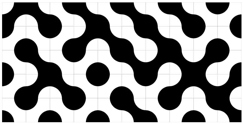
A simple example of Truchet is Smith tiles. The tiles are designed to fit together seamlessly even when placed randomly:
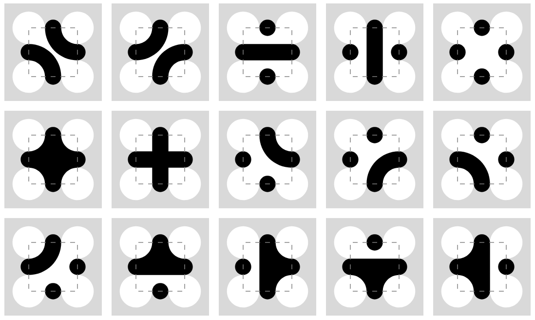
Christopher Carlson came up with a way to generalize the tiles so they could be placed on top of each other at different sizes. A square can be covered by four half-sized tiles with inverted colors and extra wings, and the pattern will remain seamless.
Here are his tiles:
It can be hard to see how they overlap, but this is a start. This is three different sizes of tile overlaid randomly, with the grid displayed to help see the edges:
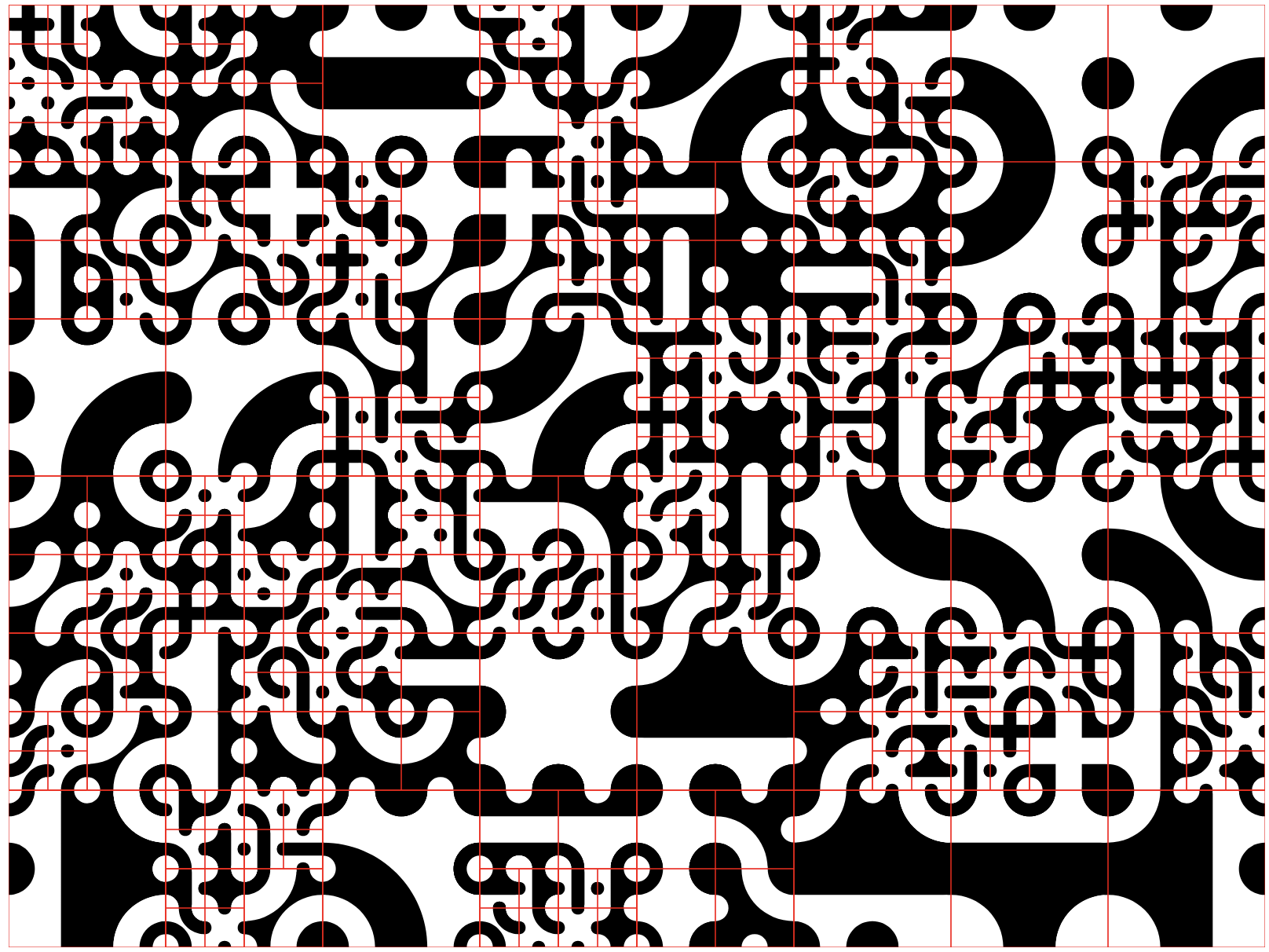
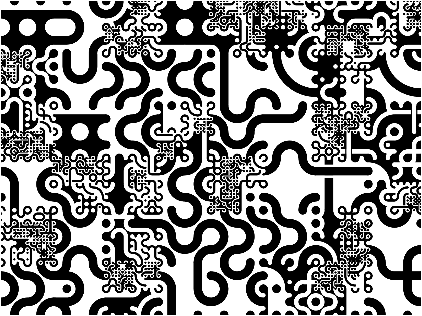
I love the randomness of these images, how shapes emerge that were not in the tiles themselves. I’ve been using them as Zoom backgrounds and desktop wallpapers. But I wondered if they could be used to create images.
The set of gray values in the Carlson set is somewhat limited, so I created a new set of tiles with more opportunities for variation:
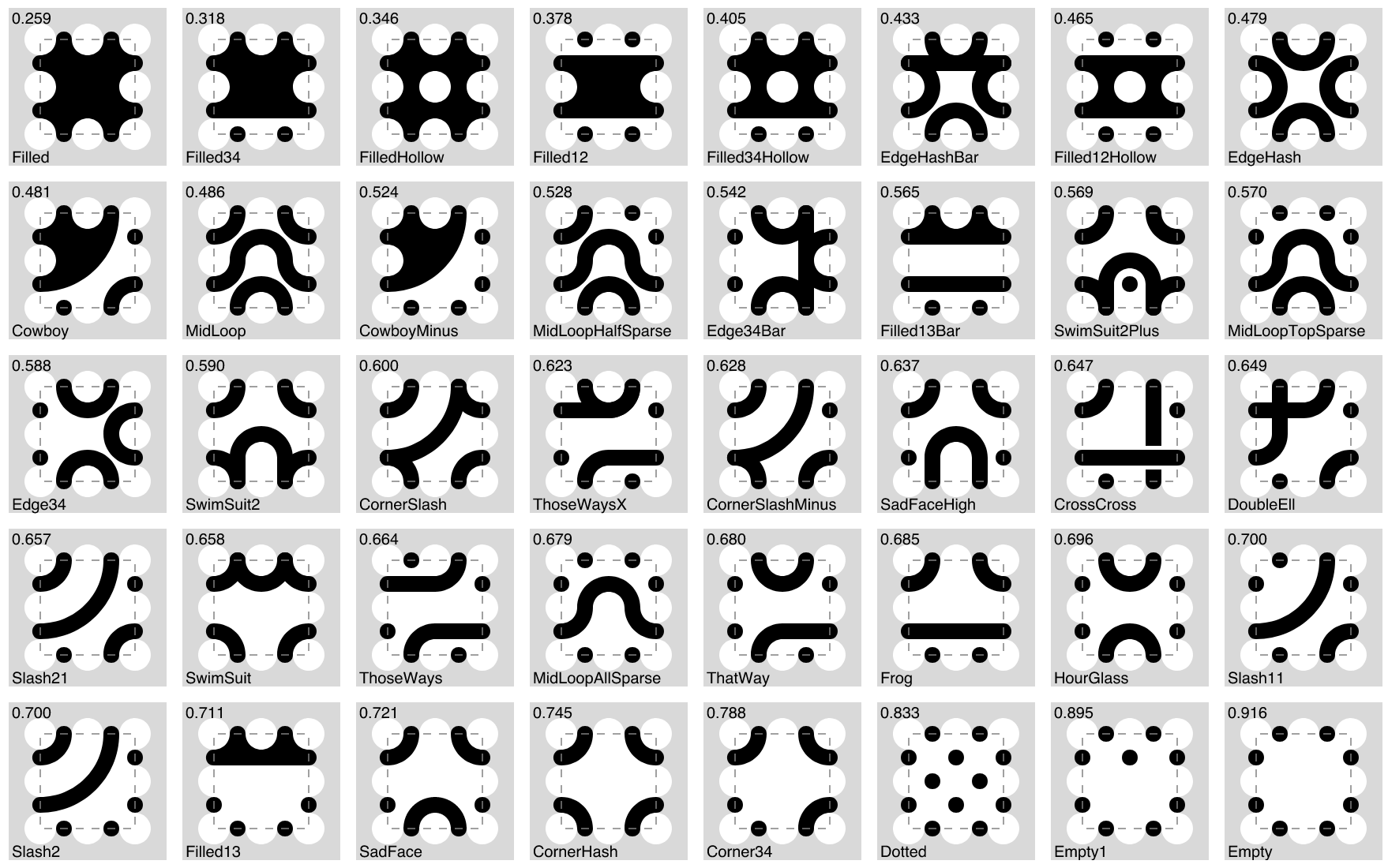
These produced even more chaos and serendipity when used randomly:
To make images, I used a photo as source and fit tiles onto it to match the gray levels. Larger squares would be subdivided when their sub-squares’ intensities differed more than some threshold:

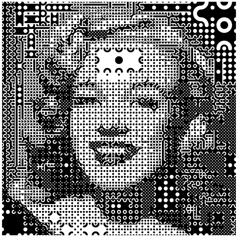

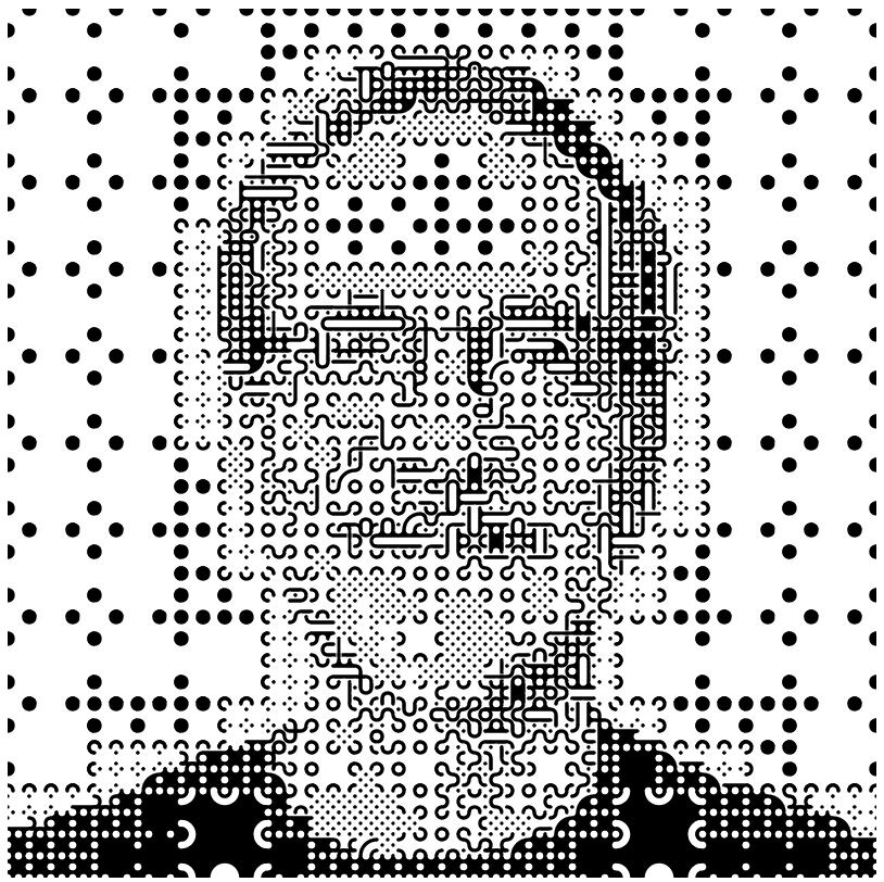
The algorithm to pick a tile will try to choose a good orientation, to match the colors within the square. Notice the tiles used for my shoulders. Though, on the flip side, both these images clearly exhibit “the forehead problem” because there’s little color variation there.
Looking around for other high-contrast images, I tried a well-known blogger’s avatar:
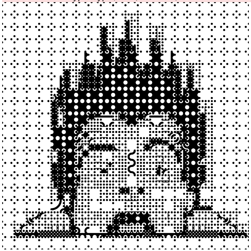
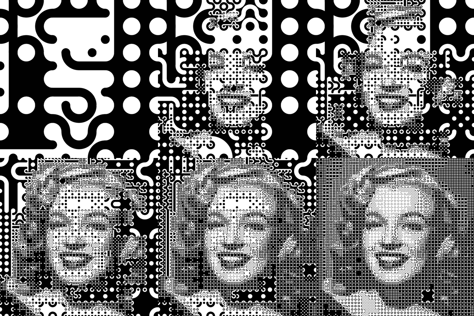
The subdivision algorithm uses a threshold to decide when a square has enough variation within it to deserve subdivision. What happens if we start that threshold very large, and slide it down to very small, animating the result?
Comments
I assume you already know about Chuck Close, but in case you don’t…
https://en.wikipedia.org/wiki/Chuck_Close
Nice work! You’ve inspired me. https://flic.kr/p/2nHQex8 Cheers!
Nice idea to create a more varied tile set by making compound tiles!
Add a comment: