| 1. | Property Trigger: mouse over and focused | |  |
| 2. | Multi Data Trigger Demo | |  |
| 3. | Button Based On Style with Target Type | | 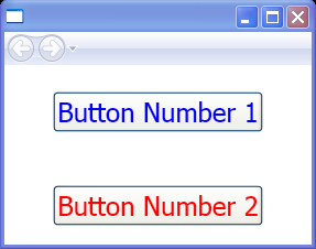 |
| 4. | Button With Local Style | |  |
| 5. | Graphics Styles | | 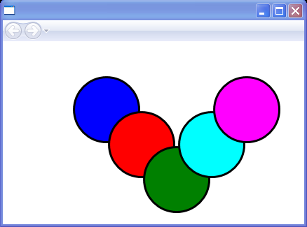 |
| 6. | Reuse Font With Styles | |  |
| 7. | Style Inheritance | | 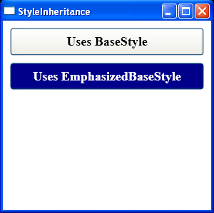 |
| 8. | Override Style Properties | |  |
| 9. | Create Styles That Adapt to the Current OS Theme | |  |
|
| 10. | Set OverridesDefaultStyle to true | |  |
| 11. | Inherit from a Common Base Style | |  |
| 12. | Add any overriding property values | |  |
| 13. | Clear customized style with Null | |  |
| 14. | Create a Named Style | |  |
| 15. | Applying a Consistent Margin with a Style | |  |
| 16. | Style applied to a Button element | |  |
| 17. | Create a custom Style and use it for Button with Style element and Setter element | | 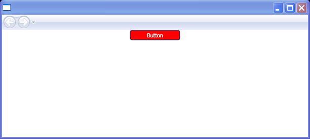 |
| 18. | Style targeting a specific type of element(Button) | |  |
| 19. | Extending a Style using the BasedOn attribute | |  |
| 20. | Target Type Derivatives | |  |
| 21. | Use number substitutions for different culture settings | |  |
| 22. | Implicit use of a Style | |  |
| 23. | Create a Typed Style for Button | | 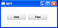 |
| 24. | The dash style of a line is specified by the StrokeDashArray property that gets or sets a collection of double variables | |  |
| 25. | Create a style for use as a FocusVisualStyle on a control. | |  |
| 26. | Style with Property Trigger.xaml | |  |
| 27. | Set a Style Programmatically | | 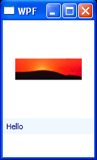 |