| 1. | Show setting the sizes of a container and its child | |  |
| 2. | Show the percentage-based sizing behavior with absolute positioning | |  |
| 3. | Using Scroll bars | |  |
| 4. | Repositioning children at run time | |  |
| 5. | corresponding controls on the right remain a fixed size because their container is fixed. | |  |
| 6. | Adding and removing components relativeTo another control | |  |
| 7. | includeInLayout="false" | |  |
| 8. | Minimum and Maximum Sizes and percent | |  |
| 9. | Alignment to center | |  |
|
| 10. | Create constraints for the right edge and the bottom edge, using the properties right and bottom | |  |
| 11. | Building within the main container | |  |
| 12. | Change the layout attribute to vertical | |  |
| 13. | Constraint Sizing | |  |
| 14. | Padding Container | |  |
| 15. | includeInLayout and visible properties. | |  |
| 16. | Get the number of direct child components in a container | |  |
| 17. | Add multiple child components, or a container that contains multiple child components | |  |
| 18. | Scrolling Spark containers | |  |
| 19. | Set clipAndEnableScrolling property to true to clip the container's children to the container boundaries | |  |
| 20. | Creating and removing a child of a container | |  |
| 21. | Wrap the Spark container in an MX container on in a Spark Navigator | |  |
| 22. | Enable Scrolling in a Container | |  |
| 23. | Example: Determining a container and child sizes | |  |
| 24. | uses the layout property of the container to set its layout to the HorizontalLayout class: | |  |
| 25. | A NavigatorContent must be the child of an MX navigator container | |  |
| 26. | Use an inline item renderer with the SkinnableDataContainer container | |  |
| 27. | Use tag to define an inline item renderer for two containers | |  |
| 28. | Scale Children of a Container | |  |
| 29. | Creating a Box container with a vertical layout | |  |
| 30. | Grid container with three rows and three columns | |  |
| 31. | Container Inheritance | | 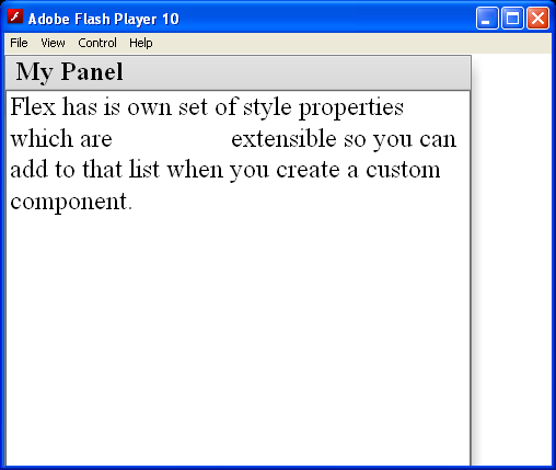 |
| 32. | Create a Button control and adds it to a container | |  |
| 33. | Add a graphic element to the container to define a background for the buttons | |  |
| 34. | size and position of each component is carefully calculated to ensure that none of the components overlap | |  |