| 1. | Use Slider to control the ScaleTransform | | 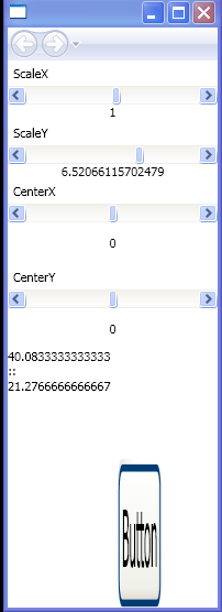 |
| 2. | Use Slider to control SkewTransform | | 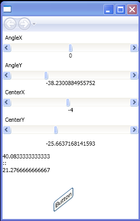 |
| 3. | Use Slider to control TranslateTransform | | 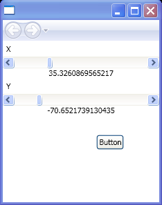 |
| 4. | Use Slider to control the Transformation | | 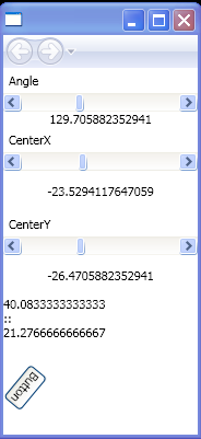 |
| 5. | Bind Slider value to TextBlock | | 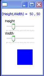 |
| 6. | Use Slider to control the Blur | | 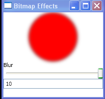 |
| 7. | Use Slider to control Drop Shadow | | 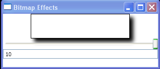 |
| 8. | Use Slider to control the Emboss | | 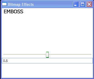 |
| 9. | Use Slider to control the Glow | | 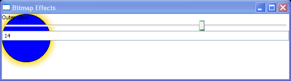 |
|
| 10. | Use Slider to control the Bevel | |  |
| 11. | Vertical/Horizontal Slider | | 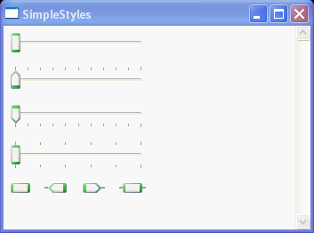 |
| 12. | TickPlacement and TickFrequency for Slider | | |
| 13. | Binding ProgressBar with Slider | | 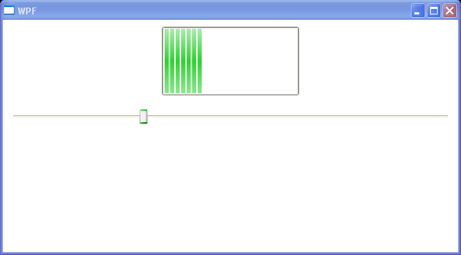 |
| 14. | Two way data binding between Slider and ProgressBar | | 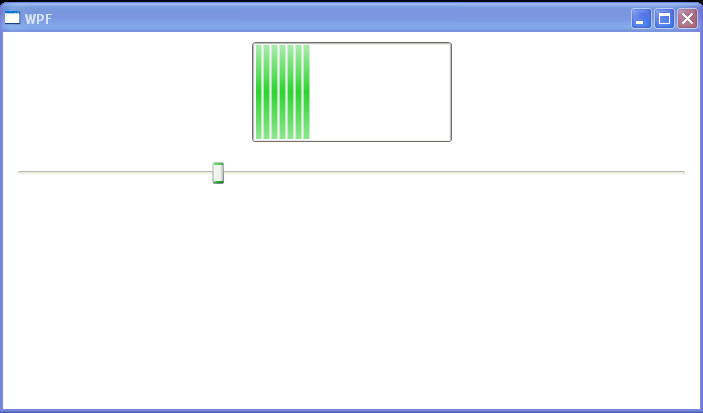 |
| 15. | Set Minimun/Maximum value for Slider | |  |
| 16. | Use Slider to control Path Scaling | | 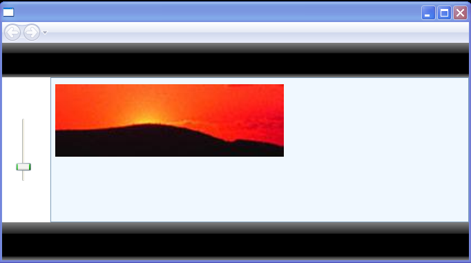 |
| 17. | Add a slider control and a border control to the content of the StackPanel, and add a canvas to the border control. | | 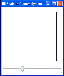 |
| 18. | Slider Attributes | | 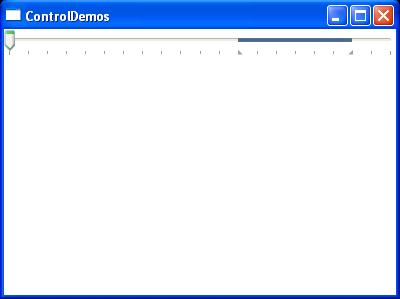 |
| 19. | Get User Input from a Slider | | 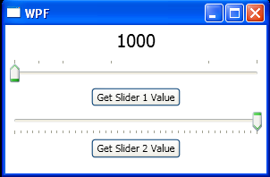 |
| 20. | slider value changed event | |  |