| 1. | Gradient background button | |  |
| 2. | Shaking Button | |  |
| 3. | Default Button | |  |
| 4. | Button with Image source | |  |
| 5. | Button with OpacityMask | |  |
| 6. | The button and text block are up-side down in the custom coordinate system. | | 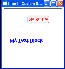 |
| 7. | TextBox as Button Content | | 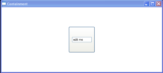 |
| 8. | Button IsMouseOver | | 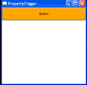 |
| 9. | Using common TextElement attached properties | | |
|
| 10. | Button HorizontalAlignment="Center" | | 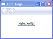 |
| 11. | Fish Eye Buttons | |  |
| 12. | Enlarge Button In Xaml | |  |
| 13. | Click to rotate a Button | |  |
| 14. | Click to scale a Button | |  |
| 15. | Change Button Alignment, Margin, FontSize and Padding in Style Setting | |  |
| 16. | Gradient Button by Rectangle | |  |
| 17. | Rotated 35 degrees | |  |
| 18. | Set VerticalAlignment/HorizontalAlignment for Button | |  |
| 19. | Button with Inline Property Trigger | |  |
| 20. | The implementation of our button's Click event handler in Xaml | |  |
| 21. | To add a button control and a text block to the canvas | | |
| 22. | Button mouse down event | | 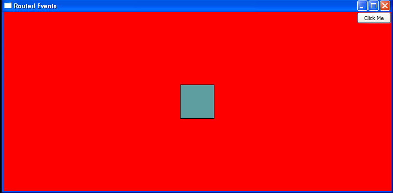 |
| 23. | Button mouse down preview | |  |
| 24. | Simple Custom Button | |  |
| 25. | Custom Shaped Button | |  |
| 26. | Set Delay and Interval for RepeatButton | |  |
| 27. | A simple template for a round button | |  |
| 28. | Load style defined in Xaml and apply to the Button | | 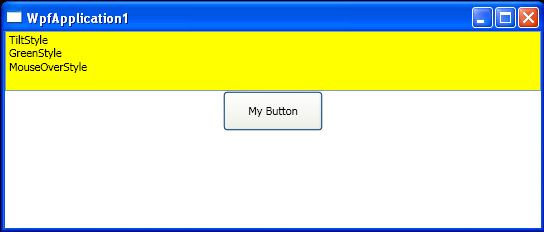 |
| 29. | Nested Button content | | 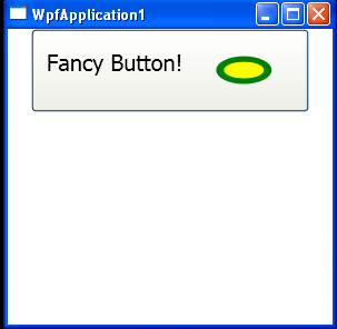 |
| 30. | Button PreviewMouseLeftButtonDown action and MouseLeftButtonDown action | |  |
| 31. | Button PreviewMouseDown action and MouseDown action | |  |
| 32. | Button click action | |  |
| 33. | Dynamically add Button to a Grid and add Action listener | |  |
| 34. | Do event based on button name | |  |
| 35. | Button Click event handler | |  |
| 36. | Put Button onto a Grid | |  |
| 37. | Add buttons to a Canvas with code | |  |