How to Say “I Love You”

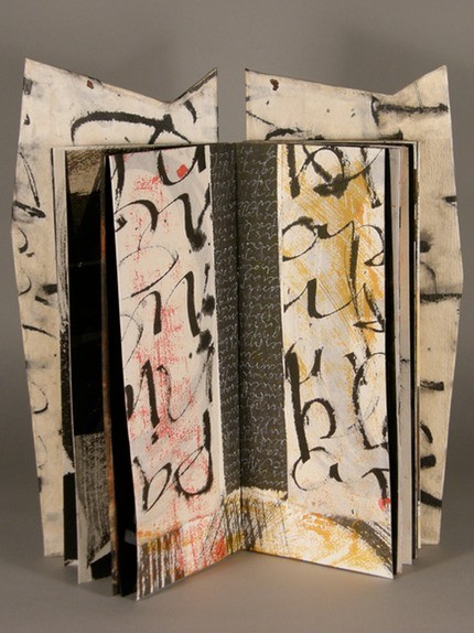
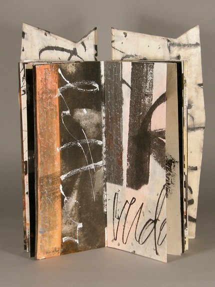
I bought several pochoir brushes at an art expo in town the other day. By coincidence, I also ran across an artist’s book with pochoir illustrations called How to Say ‘I Love You’ in Greenlandic, an Arctic Alphabet by Nancy Campbell. She says

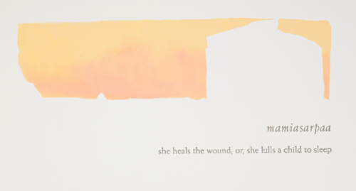
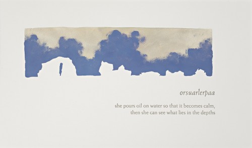
How to say ‘I love you’ in Greenlandic is an introduction to this evocative Arctic language, and presents a romantic narrative as well as a lesson in linguistics. All 12 letters of the Greenlandic alphabet are represented with words ranging from eqisimarput (‘we walk arm in arm as lovers’) to kinguneqartarpoq (‘he drinks a second brew from old coffee grounds or tea leaves’). These words and their English definitions are accompanied by a series of pochoir prints depicting icebergs. As in contemporary Arctic life, the denouement is caused by the disappearance of the ice.

Below are several spreads. She’s made a trade edition available. And a youtube video about the book.

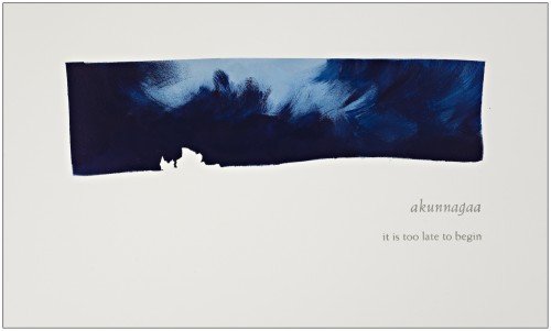
How to Say ‘I Love You’ in Greenlandic, Nancy Campbell

How to Say ‘I Love You’ in Greenlandic, Nancy Campbell

How to Say ‘I Love You’ in Greenlandic, Nancy Campbell

Happy Birthday to the Modern Printing Press

On April 14, 1863, William Bullock was awarded a US patent for the modern printing press— the first rotary printing press to self-feed the paper, print on both sides, and count its own progress. His press revolutionized the newspaper business, as it meant that they no longer had to rely on an operator who manually feed individual sheets of paper into a press. (Sadly, according to wikipedia, “a few years after his invention, Bullock was accidentally killed by his own web rotary press.”)
Below is a picture of Bullock’s press. I didn’t know about Bullock until about a week ago, when I read a nice post about him on the Afterimage blog, which also has links to more info on Bullock.


William Bullock’s rotary printing press

Monoline Italic

This past week-end I took Carol Pallesen’s Tiny Handwriting workshop. In two days she taught us 3 alphabets and we made 3 tiny books. I signed up ostensibly to work on my own handwriting but I got a lot more. Best of all I discovered my handwriting isn’t all that bad if I slow down and enjoy the task! The first alphabet she showed us was a style of monoline italic lettering—letters written with a regular pen or pencil and that don’t have thick and thin lines as a calligraphic script would. She went over each letter of the alphabet, both upper and lower case (or, as Carol called them, majuscule and minuscule), showing us how to make the strokes and emphasizing the similarities in the various letters and the proportions we should try to maintain. Here’s an example of Nautilus Monoline Italic, which is similar to her alphabet.

Nautilus Monoline Italic

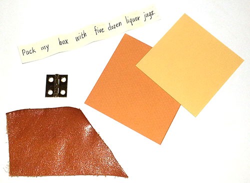
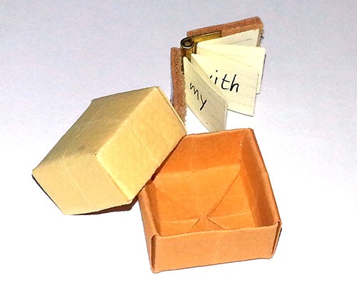
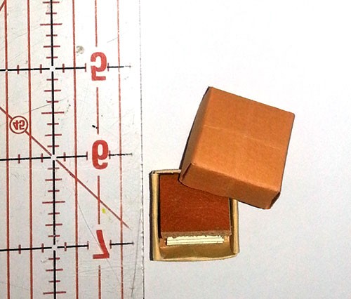
Over lunch I wrote a page of pangrams, trying to mimic her letters. “s” was really hard. And getting my letters to slant (she said about 5 degrees) was even harder as my habit is to write letters as vertical as possible. Then we made a little 3/4″ square book and a tiny origami box to put it in. The book was dead simple to make—the spine was made out of a tiny brass ornamental hinge from Home Depot and the covers from 2 little pieces cut from a scrap of leather. The inside was an accordion-folded strip of paper. Below are the pieces, and you can see my attempt at the monoline letters (the words are far apart as I put one word per panel of the accordion). Following that are the finished book and box. (I’ll write about the rest of the workshop over the coming week.)

Materials for Carol Pallesen’s hinge book

hinge book from Carol Pallesen’s tinywriting workshop

hinge book and box from Carol Pallesen’s tinywriting workshop

Tour de Lead Graffiti 2013

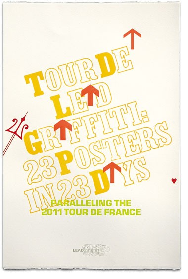
Tour de Lead Graffiti 2013Imagine letterpress printing getting a mention in Sports Illustrated! Here’s what writer Alexander Wolff wrote: “Each morning during the [2013] Tour de France, members of the [Newark, Del.] Lead Graffiti printmaking collective gathered to watch that day’s stage. They took note of every salient breakaway, pratfall and Phil Ligett bon mot, then spent the rest of the day producing a broadside that captured the action. The results are like the peloton, a riot of shapes and colors. The designers call what they do ‘endurance letterpress,’ for they repeat the routine 23 days in a row and, like the Tour itself, scrupulously post total elapsed time.”
Quite a feat—23 posters in 23 days! See all the posters here. And they’ve done this for 2011 and 2012 as well!

Laura Wait

I recently met Laura Wait, a calligrapher and book artist here in Santa Fe. She showed me a video of her latest book—she’d made it by setting up all the pages on a table and walking slowly around the table using her iphone to capture them. The pages weren’t in order yet, but it was a wonderful eyeful. I don’t really make books like that (mine have a specific order from the beginning), but I have often wanted to show a mockup to someone and don’t have a good way to do that when they aren’t here in Santa Fe. I’m going to experiment with making a video of turning the pages of a book I’m working on and see how that pans out.
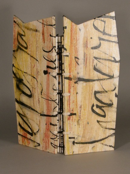
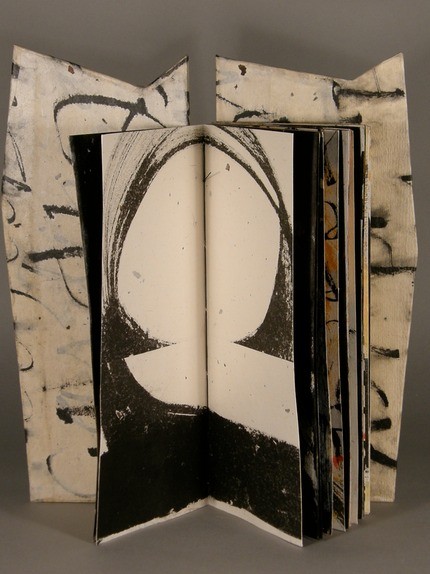
In the meantime, here are some pictures from Laura’s book Artis Litterarius (the art of words). She says it’s an homage to words, with covers like altar pieces. The words she’s used concern writing and parts of something (snippet, palimplsest). See all the pages in the book here or check out her website or her books on Vamp & Tramp.

Laura Wait, Artis Litterarius Laura Wait, Artis Litterarius Laura Wait, Artis Litterarius Laura Wait, Artis Litterarius

Snow Poems

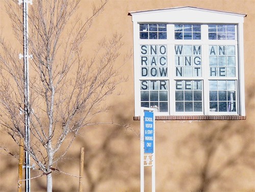
Last winter I noticed block letter poems in windows around town. They appeared to be stenciled onto the glass, and the poems had a haiku-like quality. This is the one I saw regularly, at an elementary school near my house.

poem by Joey Gurulé (3rd grade), Carlos Gilbert Elementary School

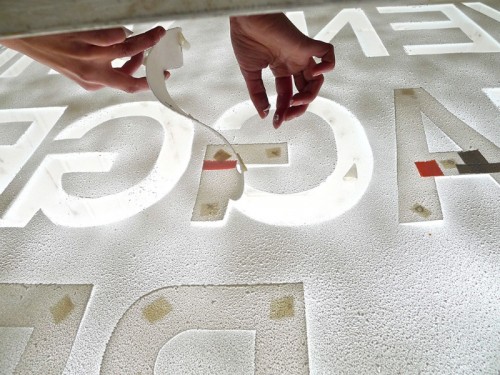
This past week, at the monthly Santa Fe Book Arts Group meeting, the organizer of these “snow poems,” Edie Tsong talked about the project — “a community poetry project that explored cities as ‘living books’ written by their inhabitants.” They asked people to submit poems and also held poetry workshops around town. They used 10″ high letters for the poems, affixing them to the windows (backwards), covering the window with snow spray, then removing the letters. I only saw the poems from the outside, but apparently the way the sun cast shadows inside the buildings was quite wonderful. Here are some more pictures, the first one showing the installation (removing the letters after spraying the snow). See more about the project here.

Installing snow poems
Installing a snow poem

A Snow poem

poem by Michelle Holland, “Doghouse” @ the Railyard
poem by Michelle Holland