A secret you may not know about us is that we love good, unique and high-quality photo content at Photo Lab. For this reason, the Feed tab you see in the app is always carefully moderated. No worries, it doesn’t mean that the combos you send to our feed are not visible to other users if they view your account. But it won’t get to the top of the Feed having one of these issues.

🚫 Low-quality pictures
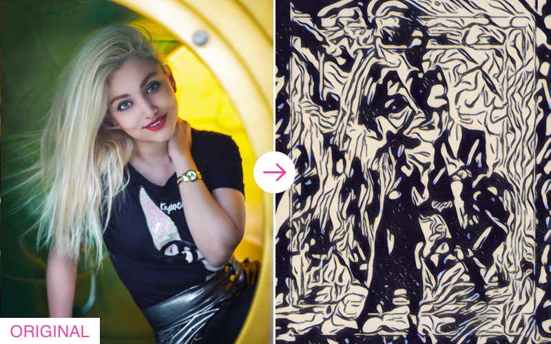
Maybe it’s too obvious for starters, but 70% of photos uploaded for editing are low-resolution: rasterized, blurred, indistinct or too dark. Feeling like Captain Obvious saying this, but an output image doesn’t have a chance to look good with an original like this.
We recommend that you upload well-focused images taken with good lighting, and set a maximum resolution in your device settings. It will make your photos better even without photo editors! The better the input photo (70% of the success) – the better your combo.
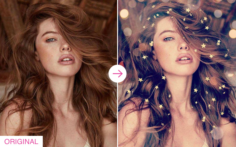
The examples below demonstrate the Pop Art Style and Neon Abstract Art effects applied to a GOOD quality and a POOR quality photo. As you can see, the difference is dramatic:


🚫 18+ content
The app’s age rating is 12+ and that’s why we do our best to keep the Feed away from erotic and porno content. We are in the same boat with you and sometimes we have a hard time telling suggestive from non-suggestive, but this is the official Google Play’s restricted content policy which we believe helps. This also explains why we do not publish combos with abusive language in texts. Needless to say that 18+ combos will be deleted and the user may be banned in case it repeats. Fair, right?

🚫 The umpteenth repost of the popular combo
It is really Okay if you have a unique view of the original combo and the result is eye-catching and extraordinary. We publish good reposts, but there is little sense to fill the Feed with numerous variations of the same combo.
The popularity will be not long coming if you:
👍 add new combos with your modifications;
👍 create a composition that goes with your image;
👍 bring something new to the Photo Lab community.

The combo itself (like the one shown above) can be pretty good as such, but it can bore you to death if you see dozens of identical effects in your feed. So we will appreciate if you unleash your creativity and contribute new unique combos:

🚫 Misleading original image
Sometimes it’s very hard for moderators to identify the original photo before editing and decide if the combo is worth publishing. For example, the face is under the mask, half-hidden by the object or covered by the frame impossible to find in the app. Other users should be able to reproduce the same effect in their photos and get exactly the same result as demonstrated in the combo. It’s not fair to show them the result with the effect they can’t apply.

Source photos should not contain any masks / stickers / filters that have been added in other apps (like in the example above), as this can look misleading for other users.

In the example above, it is hard to tell whether the flower crown was there in the original photo, or whether it is an effect added by the combo. In fact, it is a head decoration the girl in the photo is really wearing. This may also be misleading for some users who may feel disappointed when they don’t get this flower crown in their photos.
🚫 No differences detected or useless steps in a combo
Sometimes we see combos that have absolutely no difference between the original photo and the output image. It may happen when you apply several effects in your combo with the final effect that neutralizes one or more previous steps in your combo. For example, you take a B&W photo, use some color filters and finish it with a B&W effect. 🤦♂️ Or you apply one or several effects to a photo, but the last added frame cuts off all previous modifications. The examples are also: colored eyes template when the eyes of a model are closed; “dye my hair” template + color effect that neutralizes the previous result. Get the point?

In the example above, step 1 is totally senseless, as the crown and wings effect (Step 1) gets cut off by the face-in-hole effect (Step 2) added afterwards.

This is what may happen if you apply the blue eyes (Step 1) and the blue hair (Step 2) effects to a photo, and then add a black&white filter (Step 3). As you can see, the last step makes steps 1 & 2 totally senseless. 🤷♂️
🚫 The more the worse
Creating combos may inflame you, but play it cool and don’t overdo the number of effects in your combo. Limit yourself to 2-4 and try not to overwhelm your combo with 7+ steps. More steps – more time for processing, please keep it in mind when creating your future hit.

Combos with lots of effects inside them (like the one shown above) look messy and piled up. Beautiful combos rarely consist of more than 4-5 steps:

We believe this simple guideline is a way to better understanding. Hope that knowing this gives you more chances to pass the moderation and get to the Feed, and for us to get more combos from you to publish. 🤗