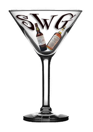

These are the bottles Eric was referring to in the email I forwarded.
Haven't worked in the jam session, mountains or usmc yet... Eric will be peeking out from the rim... ;)
I was thinking... If this -or the finished version - were set in the style sheet as the background image, then it wouldn't be the header... Maybe it could be static... Just thinking...
Yeah. We could make that a static image that doesn't scroll. Maybe set the background on the body to transparent and you can see the logo all the time. Would have to use a font color that shows good on both light and dark! Nice work!
posted by: The Bartender on December 29, 2003 05:08 PMLet's put all those other pics in one of the sidebars. I'll be putting all the miscellaneous stuff like archives and calendars and logos [oh, my!] on the left side and all the links on the right side - like Civilization Calls. I think with this nice graphic we shouldn't clutter it up.
posted by: The Bartender on December 29, 2003 05:21 PMHey guys, I love the graphic...you guys are great! Is that going to be the actual size of the graphic when it is placed on the site, or is it going to be smaller?
Actually, I just showed this to a friend, and they like the fact that the shark is circling the bowl of the martini glass...any chance of keeping that in there?
posted by: Eric on December 30, 2003 04:00 PM