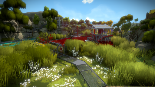
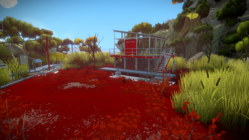
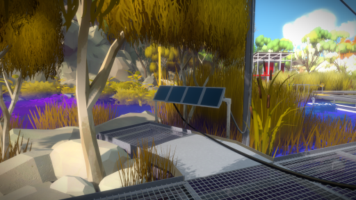
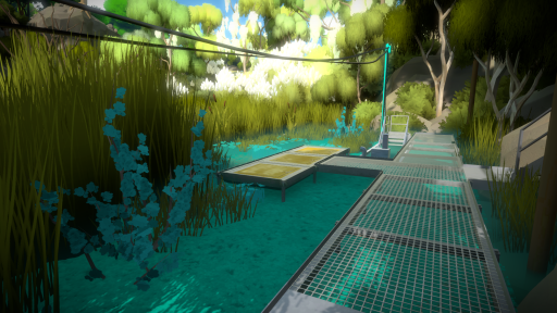
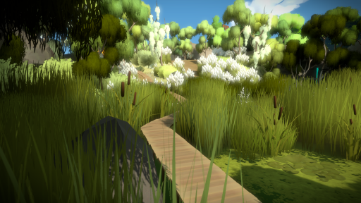
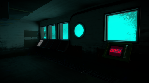
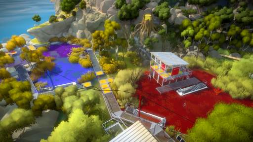
The marsh had been left unresolved for a long time, so we decided to tear it apart and finish it as a team. Eric updated the main structures, Alex adjusted the catwalks, Luis took care of all the lowest structures, and I handled the vegetation and general colors. Color was a big challenge in getting the area to look nice, since it is a marsh research facility with lots of crazy colored algae pools...there was a high risk of making it look like a clown exploded on it. With some careful color choices, attention to every detail and blocking in the views on a step by step basis, however, I think we managed to avoid that risk and succeeded in creating a pleasant, colorful area:


Nice work as always everyone.
Wow, really gorgeous work. I keep wondering where these ideas even come from. I definitely have no clear idea what this area’s puzzles will be about, which is good news in my opinion. Some areas are easy to deduce at least the general idea, but other than being related to colors. I am not sure…
On a secondary note, the first image here doesn’t have a link to a larger version. Would be a good fix for those of us who like collecting or have a wallpaper rotation of Witness screens. :)
Fixed!
If you watch the trailer closely, you can probably figure out what these puzzles are about. I think I know how to solve the puzzle in the second to last picture just from the trailer.
Which makes me kinda sad, I have no will power when it comes to spoilers :( I hope there are a lot of different kinds of puzzles that haven’t been revealed yet.
Lol, I think “have no willpower” is an understatement. I imagine you were going through the trailer frame by frame. :P
I can usually figure out a few of the early puzzles from a sequence in my head just by looking at the panel, but they very quickly become strange. So I think generally that’s the progression in the game. The first few in a sequence should be easy enough to figure out without really trying, but then it escalates and changes to test your understanding and comprehension.
Those blue orchids remind me of Upstream Color
Great movie! My favorite game developer is Jonathan Blow, and my favorite filmmaker is Shane Carruth.
Thanks Orsi. :)
I do have an observation about the trees though. I’m not sure if they’re the eucalyptus trees you had mentioned in an earlier post or some kind of willow, but I’ve always kinda thought they looked a bit more “sprite-y” than the other trees. Each little tuft really sticks out in a blocky way. I hate to be critical since I know it’s all WIP and even still I think all of the other trees and plants look great, but I did wonder if you were hoping to go back over them to make them blend a bit better. You had mentioned doing so previously because of what you’d learned from the wisteria vines, (which look fantastic) but it has been some time and I wondered if it was just something that had to be left on the cutting room floor.
I know…I know.
Oops, reCAPTCA failure moved my reply out of where it was supposed to be.
I agree with you, unfortunately, my original plan for these trees would have involved adding some polys, and now that polycount became a serious issue and we are trying to optimize everything, it’s not really an option anymore. I might find some quick way to make them look a little nicer, but it’s not at all high priority.
Okay. Thanks for the info. I had figured it was something like that, but it’s nice to know for sure. Sadly, the constraints of game development never really allow for being totally happy with everything. Just gotta prioritize the most important things and get it out the door.
Well, I wish you the best of luck. :)
I really like how you focus on using just plain colors, lighting, and shaders, rather than a ton of textures to make this look beautiful.
Conceptually, it seems more ideal for a consistent style.
Whoa! I don’t even have the words. There must be a considerable amount of geometry in the game by this point. How big is the game’s exported file size?
Again, whoa!
Man, the more I look, the more excited I get. Any rough idea of release date?
The game looks beautiful! I am interested in the sound design. What does this area sound like? Can you link a recording?
Great work. I am really looking forward to this.
I have to agree with Matthew and you about the trees. They look same-y compared to everything else (especially all the other amazing trees).
That’s beautiful…
These images of the marsh area really make me wonder if you can look directly downward in the game. I’m kind of wondering if you see the protagonist’s legs. It seems like you would have to, since I recall images that include the players humanoid shadow (which I guess probably means you’re not playing as some disembodied entity). Also, with hundreds (or was that thousands?) of footfall sound effects, it seems like you would almost have to be able to see your own legs and feet. I think it would really take you out of the game to look down while hearing these carefully designed sound effects, but not seeing the feet that are supposed to cause them. Not sure why, but I’ve been curious about this aspect of the game got quite a while. Any comments would be appreciated.
Also, keep up the great work. The game looks amazing, and I can’t wait to lose myself in it.
Well, I know we’ve seen screenshots with the player’s shadow! Maybe we encounter a mirror later in the game!
I wonder if you could look into the water or if glass reflects. I wonder if you ever get to see yourself.
This! You’ve read my mind. I wonder if you could look all the way up and all the way down too!
Can you see your hands and all or hear sounds coming from you?
The biggest thing that irks me about the old picture-by-picture adventure games like Myst and Rhem was the inability to look down, so hopefully full view will be a thing.
Good question. I wonder what could legs look like in this game. Probably something odd – like shiny black dress shoes and grey pants (like Tim had).
Never mind puzzling, this just looks like a place I’d like to chill out in. A place for wandering and nothing more. Magical!
I vote for Hide-and-Go-Seek multiplayer DLC for The Witness.
From gameplay videos, the beautiful environment feels a bit static. While I could see slight movement in bushes and grass, I hope there are varied wind speeds that might give the environment a more realistic feel. ie. As the light goes through a tree above and the wind is blowing that tree softly at first and then faster later, the light on the panel is dancing from the leafy shadows while brightness is altered due to the clouds above. This would really enhance the immersion factor…
I cannot believe that it has been almost 4 years to the day that I first posted on the initial concept art posting from back in February 2010!
Though it is merely my second time posting here, I have nonetheless been visiting rather frequently – Monthly, Weekly and in the last year or so even daily. Suffice it to say that my excitement level for this piece of software cannot easily be comprehended. I am sure that I am not alone in saying it.
Anyway! Thanks very much to the WHOLE team at Number None and to everyone, everywhere, anywhere that had something to do with this project. I cannot wait to ‘feel’ my way through this assured masterpiece of design, logic and beauty.
Everything that I have seen to this game looks preposterously gorgeous and elegant. When taken from afar (island snapshots) everything just looks so wonderfully compartmentalized and simple, yet upon a closer look we see that every area has a life of its own and is so varied in a biome or niche of its own. I cannot wait to cross the blended boundaries of Emerald Forests, Sandy Beaches, Snow Capped Mountains and autumnal hued locales. I haven’t seen a game with artistic design and merit such as this since I last spent some time with Journey… and that game holds fast to the top spot of games that I have been privileged to experience in my lifetime, perhaps with Braid following within the top 3.
Wow. 4 years! It really seems to me that this project was taken at the right pace and seems to be ramping up into a damn fine crescendo!
Good Luck Everyone!
Postscript: I would gladly put my life on hold to Beta test this thing. However I fear that I have a monumentally greater chance at striking the winning lottery numbers than I do of that. At any rate, I will be right there with everyone else day 1 when this thing goes live!
I hope you dudes and ladies sell copies into the most copious of amounts. Something along the lines of 100,000,000 copies should make me happy. :)
I saw Number None somewhere else in reference to this game recently and it made me wonder: didn’t the company used to have the name Thekla? When did it switch to Number None? Or am I confusing something here?
Number None is no more. That was just John, in Braid.
Thekla Inc. is the company/team behind The Witness now.
Really impressed with graphic style and game design. Intriguing puzzle mechanics too.
Is the engine yours???
Thanks. And put on bookmarks.
From the last minute area post and this marsh update, it sounds like the art team has started to finalise the modelling work for the island. Am I miss-assuming that you guys are near the end of the tunnel or are there still more areas to be finalised?
Beautiful. I’m curious about how each unique area possibly affects the themes of the line puzzles. I wouldn’t be surprised if you created a puzzle out of the cables that go into the screens. It must be kind of fun building a sort of powerline system. I dig how you have steps that go underneath the marsh there in the last picture and how you may be seeing the marsh from underground in the pic above it. That yellow block in the tree stump also raises some curiosity. It must be just as much fun and hard work to make this game as is to play.
It definitely looks like someone exploded in it. Just look at all that blood!
Being colorful doesn’t mean being ugly. I think it could have fit another color.
Guys congratulations on this beautiful work. I’m brazilian and really want to buy this game and give it on my friend’s birthday!! He’s starting design college and would appreciate all the aspects of your efforts (things I cannot even imagine).
Thank you!
Are those photovoltaic panels in the third picture? Looks like they are… but being in the shade and placed almost vertically… I’m not sure anymore.
I think they are puzzle panels. They just aren’t active in the screenshot.
A few things:
1 – Anyone know if/how we can watch Luis Antonio’s talk on The Witness from GDC yesterday?
2 – Here is a brief article on the talk: http://www.polygon.com/2014/3/20/5526180/the-art-of-jonathan-blows-the-witness
3 – Just for fun, here’s Jon doing tai chi in the park (presumably at GDC): https://twitter.com/daphaknee/status/446432534730399745
Luis has the slides on his blog for now: http://artofluis.com/2014/03/21/gdc-2014-the-art-of-the-witness/
That article got so many things horribly wrong…
Not really a surprise that they got a lot wrong. Most enthusiast press really don’t understand anything about how games are actually made. They fool themselves thinking that because they had xyz class at university that they totally know how it all works. I hate to be cynical about it, but it’s frankly embarrassing.
Those slides are very nice, but ooh ahh plot spoilers! I averted my eyes a bit there. :P
Thanks for posting the link Orsi.
Now I really want to look, but at the same time, I’m trying to stay as spoiler-free as possible. Can anyone who’s looked at the slides give a sense of how spoiler-heavy they are and/or if the spoilers are easily avoided? I’m desperate for more information about this game, but I don’t want to ruin anything. Such decisions! It’s killing me!
Just stay away from slide 23; that looks like the heaviest spoiler-wise. All the other slides are mostly pictures of the island from different angles.
Chris
Oh my gosh! thanks for sharing that!
From the slide displaying 3 distinct time periods, in Luis’ presentation, the last one reads 1800-2500. Is the game really set that far in the future?
The flat shaded, organic geometry in the rocks and trees looks really great. It breathes new interpretation into what is normally a train bearing down on photorealism.