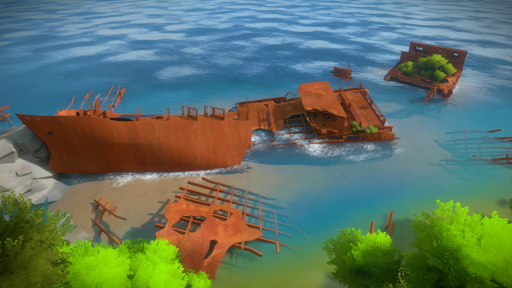
The shipwreck is an area of the island that has not been shown before, because up until recently it was one of the barest, most undeveloped areas we had. It grew bigger and bigger over the years (like most things on the island), from a little slab mockup Jon had by the shore, into a massive freighter with the usual, intricate gameplay requirements.
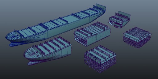
The process for building this ship was interesting. We have architects helping us with building designs, but even the architects were not entirely familiar with the structures of ships. We spent a lot of time looking at reference images, talking about the materials and how the entire structure would decay over time. They gave me a base design for the hull, deck, bridge, and the inner beams of the ship. I modeled that whole, then split it up into five pieces.
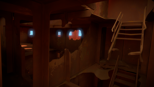
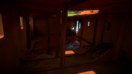
The front, middle, and back pieces were kept somewhat intact, the rest was split into scattered rubble to dress the scene. Next, it was time to figure out the gameplay and decide what parts of the ship would be accessible and what parts would be rotten away. Because the ship was so huge and I was modeling it alone, I had to be careful about limiting what would be navigable and what would be seen, since I wanted to keep my workload to a minimum while still having very interesting, believable areas. I spent a long time cutting holes, bending floors and ripping out beams.
Then, I had to figure out how to make a decaying heap of metal with our simple, clean style, as described by Eric in the last post. My first attempts had minimal detail in the geometry, with a lot of noise and contrast in the textures. It was exactly the opposite of what we usually do, but I was trying to develop a process for detailing the entire ship quickly, and it's a lot faster to use blendmaps to add noise than to tediously cut and shape geometry. It looked terrible, but I was at a loss for how to make it better quickly. Fortunately, Luis and Eric encouraged me to just reduce the contrast in the textures, and let the small details in the modeling stand on their own. It took ten seconds to lighten some textures, and all of a sudden I had something I was finally happy with. At first it felt wrong to leave large surfaces so plain, but the other artists were right. With our beautiful lightmaps and simple style, a little detail and a few modular rubble and rust pieces were all that was needed to make the space feel like it belonged to our game.
This shipwreck is still not quite finished, but it is the last huge project on my plate before moving on to the many smaller projects and tasks we still need to complete to ship the game.


I can not wait for this game, this art style is amazing, and with a world so vast yet so small, I may spend most of my time just exploring the island over and over again.
It looks nice. With the lightmaps auto-generated, I bet this art style saves alot of content-creation work that would otherwise be too expensive and time-consuming.
The first image of the inside of the wreck honestly looks amazing! I really can’t wait to explore this ship in the final game :) .
Question about the artwork: Seems like all current gen games and all the next gen games we’ve seen so far heavily take advantage of normal maps for their artwork, yet it looks like this game uses them minimally, if at all, and lets the geometry completely define the form, correct? I’m surprised you guys were able to make a beautiful looking game while completely disregarding this industry norm. Just shows you that all rules are meant to be broken :) .
Huh. For what we have seen so far of the game, it has been beautiful. But this just looks kind of confusing and bare to me. Maybe it’s because I’m not familiar with what a shipwreck should look like, so my mind isn’t able to fill in the details. Or maybe I just need to explore it in game to “get” it, I don’t know.
It isn´t finished yet. So I´m not surprised that it´s looking rough for the moment.
This reminded me of the “SS Maheno”. And you’re right that there’s definitely something “off” about this ship. I’m hoping it does get improved on.
To me it looks like they’ve not finished “bedding” it in its environment. In particular: the texture doesn’t change at the water line.
Also a lot of the damage looks very deliberate. The huge holes adjacent to very solid surfaces looks quite unnatural. Especially the holes that seem to have formed independently to supporting framework.
Awesome and interesting read. Looks like it’ll be fun to explore the shipwreck!
So excited to get two posts so close together! Looking great!
Wow! The game so far looks really amazing, I’m highly anticipating it’s release. And if I may ask, what kind of texture maps did you use throughout the game? (diffuse/normal/light/bump/reflection/etc.)
Thanks a lot, and keep up the awesome and inspiring work!!
I really love these updates :) Can’t wait to explore this world in the final game.
Which 3d applications do you use in your workflow?
The attention to detail is fanatical, absolutely unique.
Is there going to be a little ship somewhere else that you have to puzzle over and then the ship floats again?
That ship aint ever gonna float again. But amusing reference none-the-less :)
If you designers have the time (ha), I would be highly amused and might giggle uncontrollably if you put some small parody of some other adventure game puzzle in your map somewhere…
Wow. I love the way this game is starting to look. It seems to have a very distinct art style. And, beauty in games doesn’t always need to be defined by the amount of detail and realism – a game can be just as beautiful when it has a coherent style across the board, and this game seems to shaping up to be quite a looker.
Anyway, I always enjoy the posts. Keep ’em coming!
I think this will be the true successor of Myst and surely a real masterpiece.
Please, how much time is left to the completion?
Many thanks for your fine work
PS: I tried many times to signup for email newsletter, but your system does not send anything to me.
As always, awesome stuff! Damn that lighting is fiiiiinnnnne.
This game is such a breath of fresh air for the gaming industry. You can tell you guys have a lot of pride in this game. Looks amazing. Can’t wait to play it on the PS4. Please, just take my money already. I really, really, want to play it.
This is my favorite location revealed thus far. I have a certain love for spaces that normally shouldn’t have water in them that end up having some, like, certain areas in Half-life and the underwater scenes in The Abyss and Alien Resurrection. What better way to demonstrate decay and abandonment. There is something poetic about nature reclaiming the mechanical.
The promise of this area though… It looks so fantastic! I am very interested to see how one gets inside, wether it’s through that grey rock, or if you have to swim onto it.
The interconnectedness I detect here reminds me of Shadow of The Colossus, and that, is a great thing.