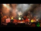
Ryan Lesser: I wanted the game to be reminiscent of the more serious, more pro, more extravagant side of Rock and Roll. Big Rock from the '70s was a real inspiration for me. A few of us, including Kevin McGinnis (our Shell Lead) had been roughing out the idea of having the shell look like early rock video stuff. That grew and grew and I started to get really inspired by TREX's Born to Boogie live footage shot by Ringo Starr and early rock documentaries and live performances. I started describing to everyone the look; film grain, rich color, handheld cameras, musicians interacting with the camera, exposure flicker, etc.
One important moment in the development of the look was when Rob Kay (Lead Designer) digitized a little moment from The Who's performance from The Kids Are Alright of "Won't Get Fooled Again" where they come back from the bridge and Roger Daltrey is doing his little jig and then Keith Moon starts killing the drums culminating in this insane moment where all four of them hit a note and explode. The camera shifts and goes slo-mo and Pete Townshend powerslides past John Entwhistle. It was so great and summed up the whole vibe in 15 seconds. This clip lead directly to my concept of Directed Cuts, where the characters do amazing rock moves for the camera's sake. David Lee Roth in the "Jump" video was also a big inspiration for the Camera Interacts.
Pete MacDonald: Ryan had some pretty clear direction for us right from the start. He wanted the game to look like a live performance music video -- the kind where they take footage from several live performances and edit them together to get all the most exciting moments into one video. This approach was a big change for us and freed us up to do things like show the guitarist doing a power slide, then cut to the same guitarist standing on top of a grand piano.
As far as the presentation of the stage, crowd and lights, we wanted the space to feel timeless, atmospheric and authentic. By "timeless" what I really mean is pre-digital age. We wanted it to feel like 1979. Not that there's anything special about '79, but it means you can have psychedelic and early Heavy Metal art without being ironic about it, and you don't have laptops or digital sound and lighting equipment.

The art for this San Francisco venue was inspired by psychedelic poster art from the mid-sixties.
GameSpy: So, with that in mind, what kind of new little details should we be looking for in the venues?
Pete MacDonald: The camera work is the most noticeable change. The characters interact with the camera, kicking it or head-butting it. The camera cuts very quickly and there's no continuity. You'll see the singer and bassist singing together, then next cut you see the singer doing a stage dive. That kind of stuff just wasn't possible in our previous games.
Ryan Lesser: Yes! I love this stuff. It took a while for us to get it in, but once it went in, everyone could see how cool it was. The first time you see the singer kick the camera it is just so rad!
Pete MacDonald: Our lights are all new technology. We have volumetric fog, HDR and greater realism in the lighting in general.
We use a variety of post-process effects to re-enforce the whole music video look. Some songs will have a soft sepia look to them and others will use grainy black and white or look like a green security camera.
Ryan Lesser: Pete and I had a lot of cool ideas for these post-process effects, some of which made it in. He did an awesome job working these in to give the feel of film without going overboard.
Pete MacDonald: The venues' stages are more realistic. You won't see any giant cartoony animatronic zombies, but you will see some killer pyro fx and amazing light and video displays. All the sound equipment is real stuff and super-detailed. It's all done that way to make the live performance feel authentic.
Ryan Lesser: On the realism tip... I think our first amp that Sasso modeled for the game had about the same amount of polys and pixels as a character from our last game! We wanted the gear to have as much character as anything else... wanting to see the silverface mesh on amps or the glow of the warm tubes behind the heads. Obviously... the programmers slapped us silly but it did set the tone. We wanted awesome detail in venues.


