Tiles provide quick access to information and actions users need to get things done. After performing a swipe on the watch face, a user can see how they're progressing toward their fitness goals, check the weather, and more. Users can also launch apps and get essential tasks done quickly from tiles.
Users can choose what tiles they want to see on their Wear OS device, both from the device itself and from the companion app.
UX design principles
The system-provided tiles use a consistent design language, so users expect tiles to be each of the following:
- Immediate: Tiles are designed to help users quickly complete frequent tasks. Display critical content in a clear information hierarchy so that users can understand the tile's content.
- Predictable: Content within each tile should always focus on a user-facing task. This helps users predict what information they will be able to see on the tile, which improves recall.
- Relevant: Users take their Wear OS devices wherever they go. Consider how the content in the tile is relevant to the user's current situation and context.
App icon
The app icon that may appear at the top of the screen is automatically generated by the system from the launcher icon. Don't make this icon part of your tile's layout.
Do
Don't
Design guidance
Keep the following guidelines in mind when creating tiles.
Focus on a single task

Do

Don't
Create separate tiles for each task
If your app supports multiple tasks, consider creating multiple tiles for each task your app supports. For example, a fitness app could have both a goals tile and a workout activity tile.
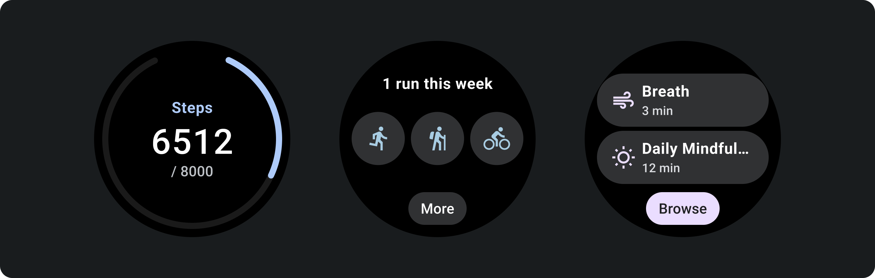
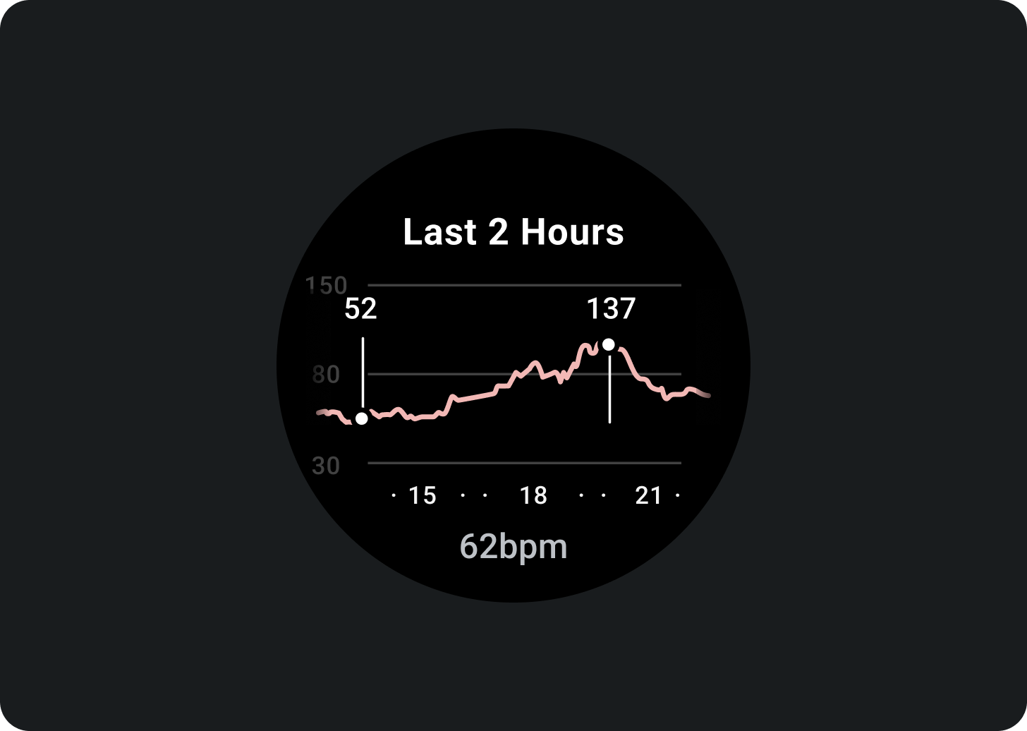
Show glanceable representations of graphs and charts

Do
Don't
Indicate latest data updates
Make it clear to users how recent a tile's data is. If you show cached data, indicate when it was last updated.

Use an appropriate data refresh rate
Choose an appropriate update rate for your tiles, considering the impact on device battery life. If you're using platform data sources such as heart rate and step count, Wear OS controls the update rate for you.

Empty states
Tiles have two types of empty states. For both, use
PrimaryLayout.
Errors or permission
Tell the user that they need to update their settings or preferences from the tile.
Sign in
Provide a clear call to action on a sign-in tile.
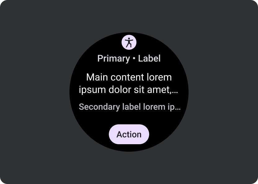
Show ongoing activities
When an app performs a long-running activity—such as tracking a workout or playing music—it should show the progress of the ongoing activity in one of more tiles.
If your app also supports tiles that allow users to start these activities, do the following to minimize user confusion:
- Indicate that an ongoing activity is already in progress.
- If the user taps on such a tile, launch your app and show the in-progress activity. Don't start a new instance of an ongoing activity.
Required elements
- Primary data: The main content that describes the activity.
- Label: Displays the status of the activity.
Optional elements
- Icon or graphic: Can be an animation or static image.
- Bottom compact chip: Contains a call-to-action.
Motion on tiles
When you add animations to tiles, help users understand changes:
Do

Don't
Previews
Add a tile preview to help your user see what content is shown in the tile manager on their Wear OS or handheld device. Each tile can have one representative preview image. That image should meet the following requirements:
 |
Requirements
|
 |
 |
| A tile preview displayed in tile manager on a Wear OS device. | A tile preview displayed in tile manager on a phone. |

Do

Don't
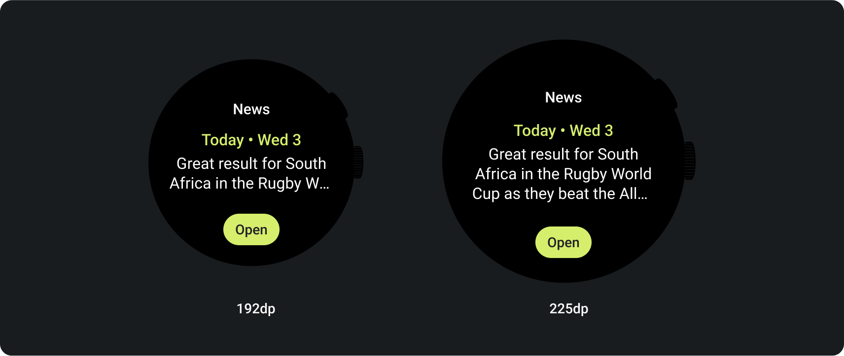
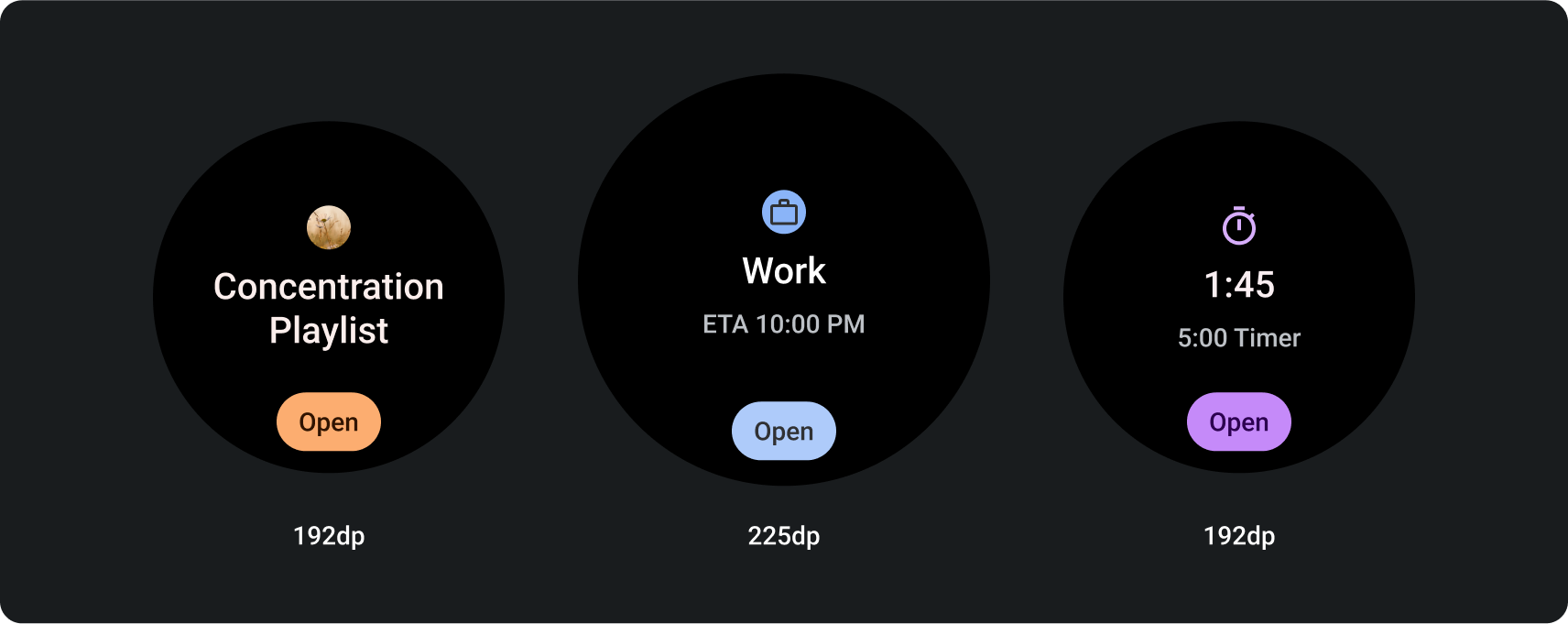
Larger screen sizes
To accommodate a variety of Wear OS screen sizes, the ProtoLayout Material layout templates and Figma design layouts include responsive behavior, allowing the slots to automatically adapt. Slots are designed to fill the available width. The main content and secondary label slots hug the content, but the container holding them fills the available height. Margins are set as percentages, with additional inner margins added to slots at the bottom and top of the screen, accounting for fluctuations in the curve of the screen as it enlarges.
To maximize the larger screen size, use the additional space to provide more value by allowing users to access additional information or options. Achieving these layouts requires additional customization beyond the built-in responsive behavior, such as by creating an additional layout with more content or by displaying previously hidden slots after the breakpoint.
Note that the recommended breakpoint is set at the 225dp screen size.
Examples of how to design for a larger screen size
Add buttons
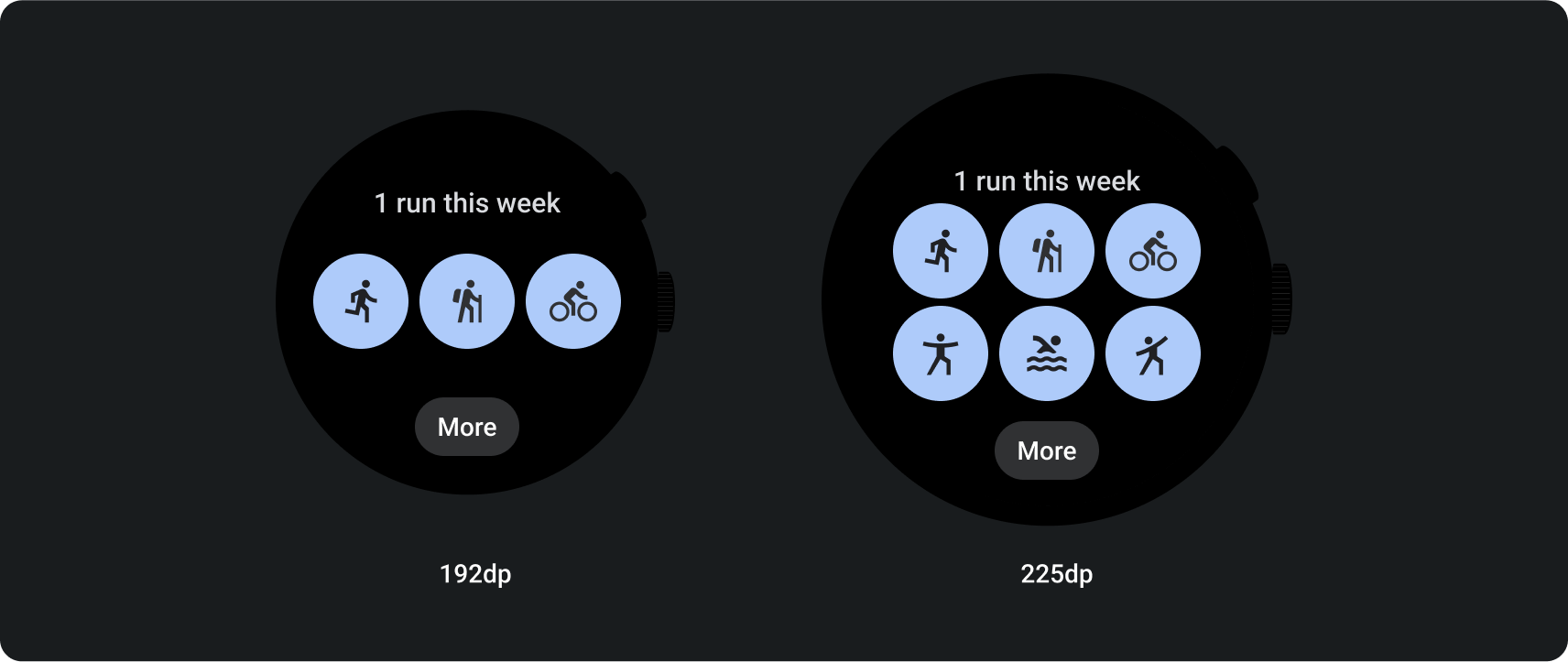
Add slots and content

Add text